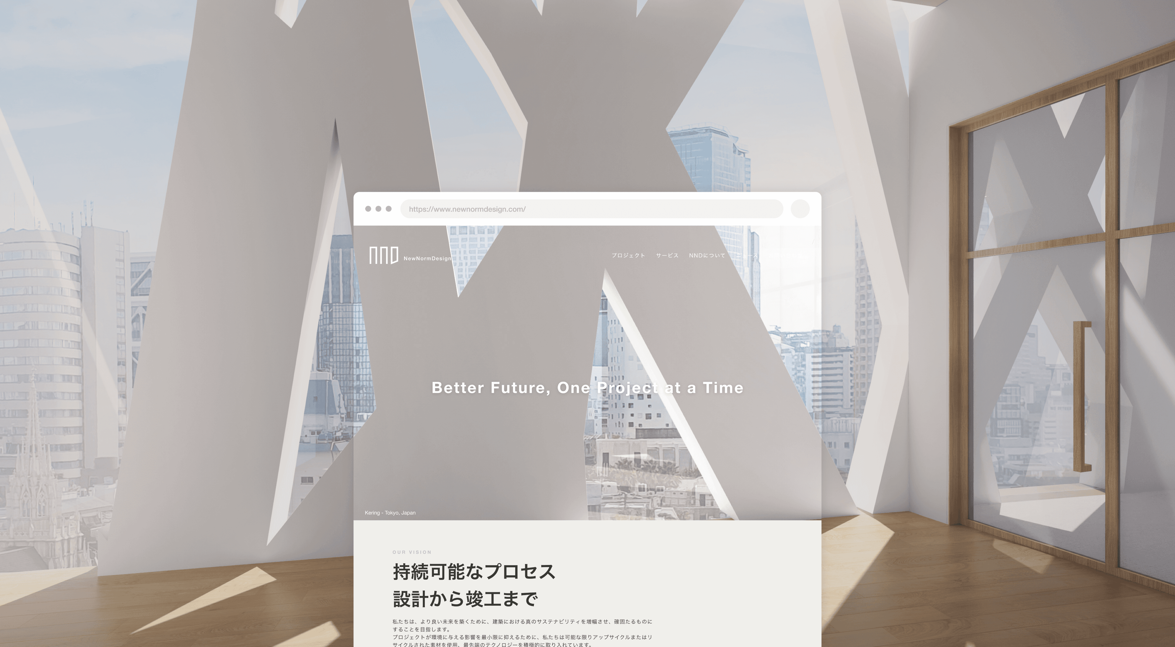
NewNormDesign
NewNorm Design (NND) is a sustainability-focused architecture firm aiming to design eco-friendly buildings and spaces.
As part of their growth, they wanted to update their website to better showcase their mission and work. I took on a website redesign project for NND to create a fresh, modern online presence highlighting their green approach.
my Role
Concept, Web Design,
Content, Localization
settings
Solo project, client work
tools used
Figma, Miro, Illustrator,
Squarespace
duration
1.5 months
(2022)
Project Overview ↓
Discover
・Heuristic analysis
・Research
・Stakeholder workshop
Ideate
・Brainstorming
・Visual identity
・Design system
Design
・Sketch
・Wireframe
・Prototype
・Element design
Content
・UX Writing
・Translation
problem space
NewNorm Design's English-only website limited their outreach to Japanese clients, their core target audience. Mismatched branding and confusing site architecture on their website posed navigation challenges, hindering full visitor engagement.
ideation
How might we tailor NewNorm Design's website for the Japanese target audience, while maintaining cohesive branding and intuitive navigation to boost user satisfaction?
Reflections & Takeaways
design direction
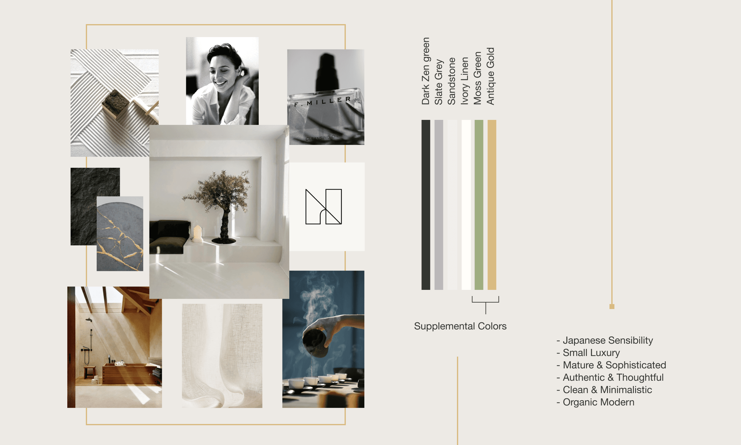
Defining visual identity
Sustainable
Mature
Sophisticated
Knowledgeable
Warm
Classic
Cool
Minimalistic
Formal
Logical
I gathered key information from early research and put together a moodboard to showcase potential ideas and visuals for the website's brand look and feel.
This allowed me and the client to get on the same page before I started designing.
milestones
> Defined the visual identity of NND
> Aligned my ideas with the client’s vision before starting the actual design process
information architecture
Restructuring the website
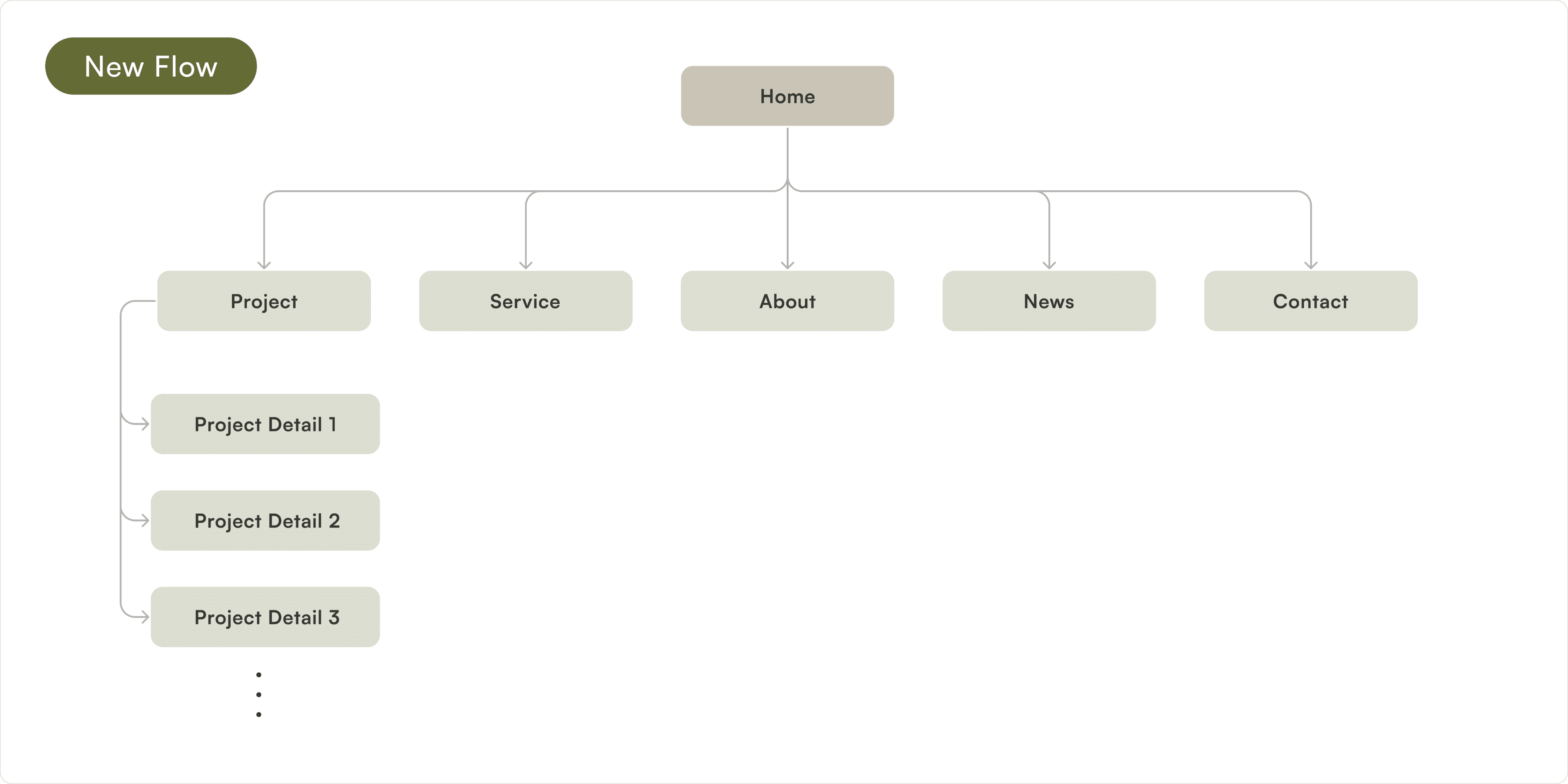

↑ Added some pages to better represent who they are and what they do
After defining the visual identity, I focused on restructuring the website's information architecture. The lack of information and confusing navigation was hurting the credibility and appeal of the site.
Based on requirements confirmed at the first stakeholder workshop, I reviewed the existing content and site structure to add necessary pages and optimize the IA. This addressed issues surfaced during initial discovery and better met site goals.
milestone
> Enhanced website organization and content structure to elevate user experience
ui design
Designing the interface
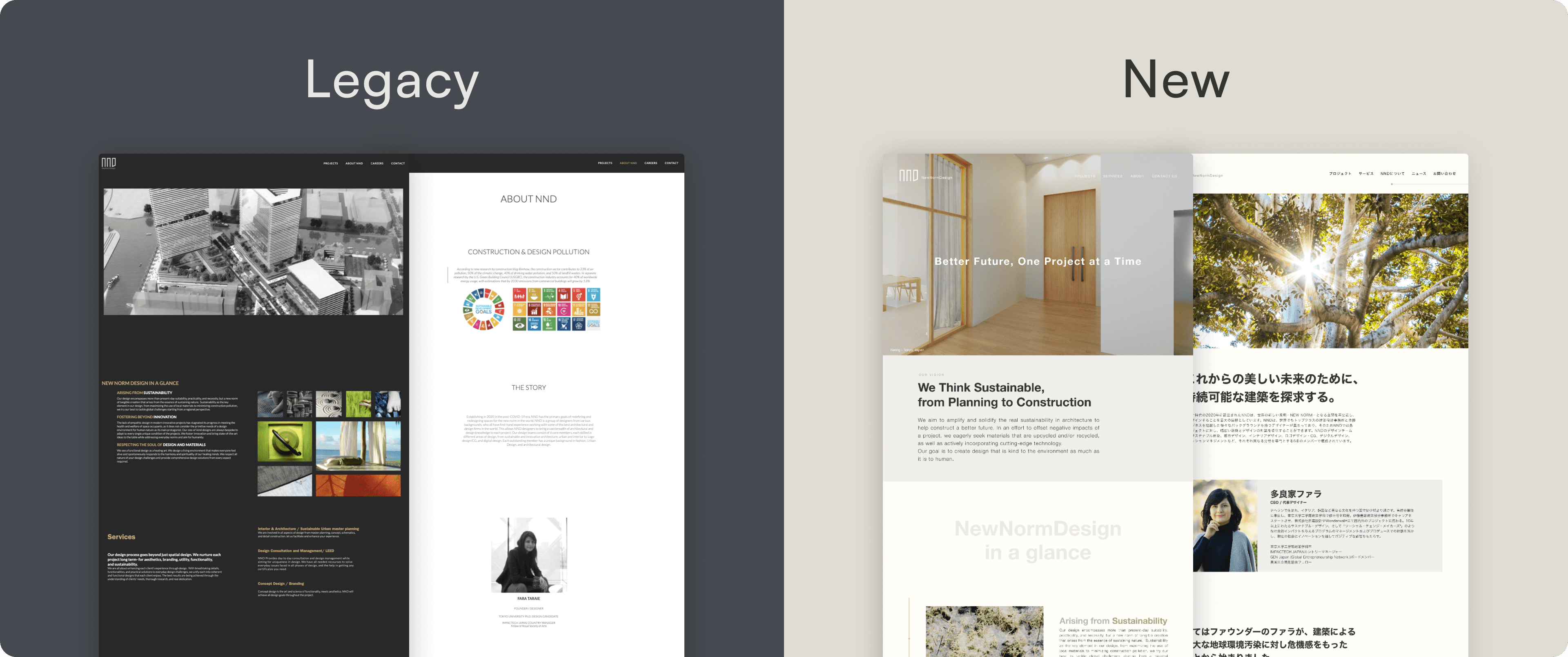
milestones
> Sketch, wireframes, mid-&high- fidelity design
> Created 2 different variations for comparison
> Designing element to complement the narrative
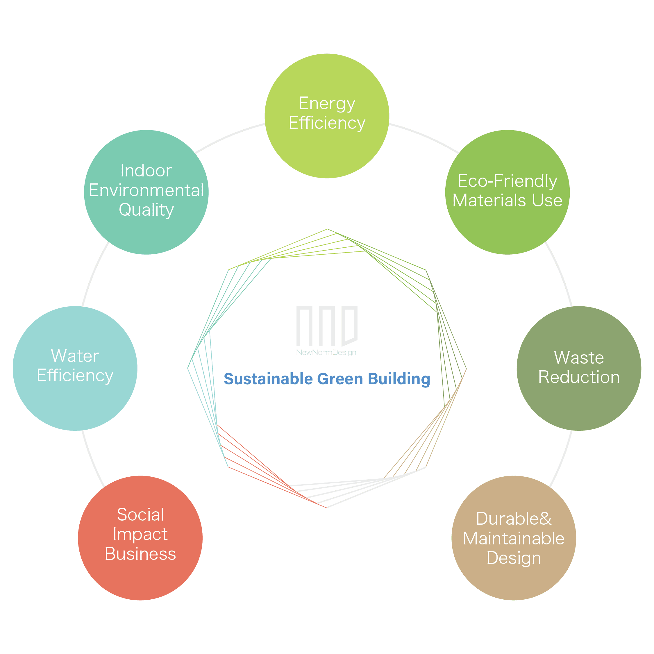
Designing elements →
While I was working on the design, I received some requests to add additional information to the website. To address this, I developed new elements to effectively organize and present the content.
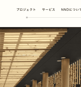
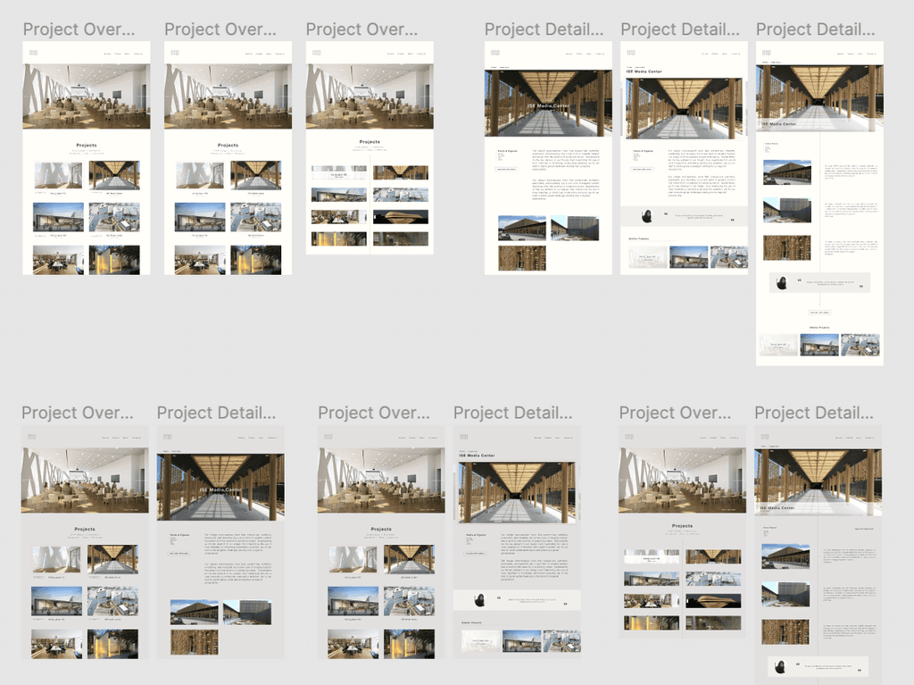
← Mid-/High-fidelity prototypes
I created 2 color variations of mid-fidelity design for the client to review, then after created the final prototype.
Inspired by their architectural project and moodboard, I integrated "wooden blocks" into my design system, and used them across the website.
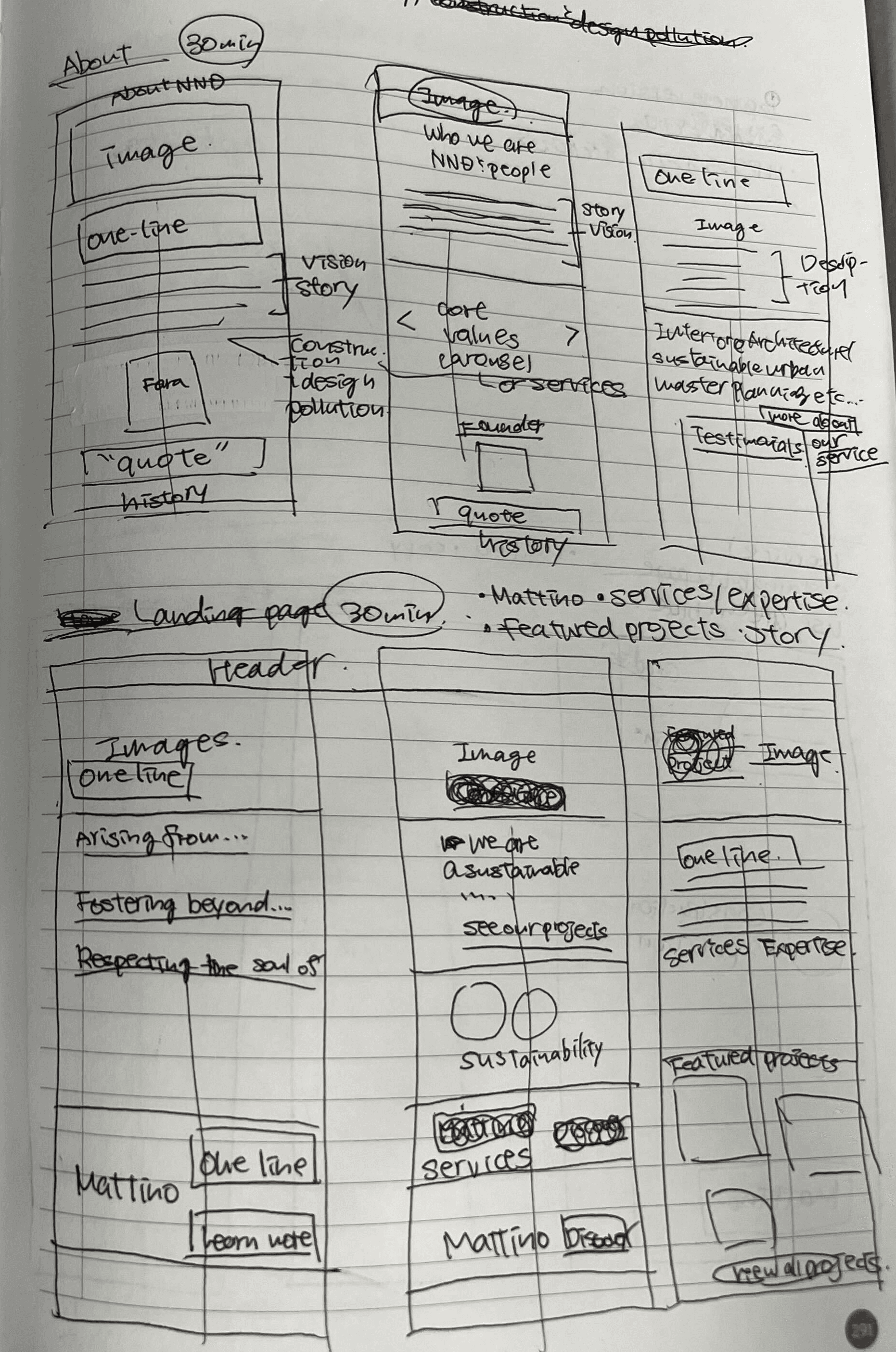
← Sketching & Structuring
I started sketching after doing some research online.
I worked on structure first then the design, referring to the UI patterns of the websites client selected in the 10-second gut test.
It was a mess, but helped me visualize my ideas.
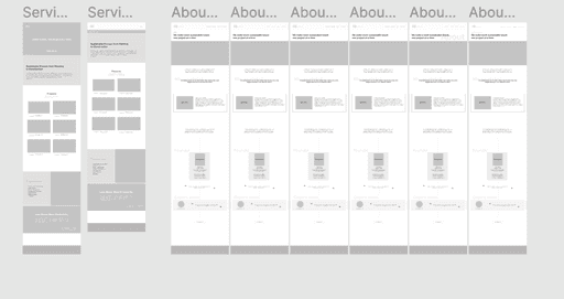
Low-fidelity wireframes →
Then I proceeded to create low-fidelity designs, dedicating the most time to this phase. Here, I sought advice from a developer friend to ensure the technical feasibility of my design.
content
Crafting the voice of NND
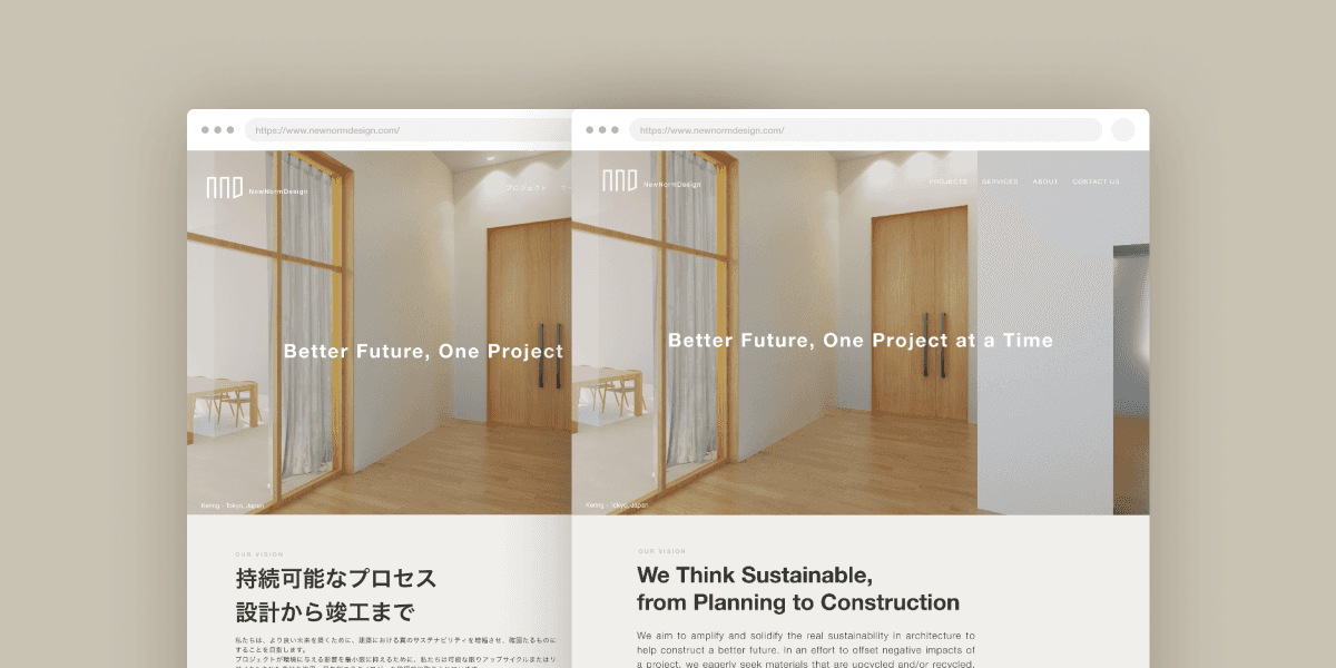
milestones
> Developing new copies and content
> Localized content for the Japanese audience
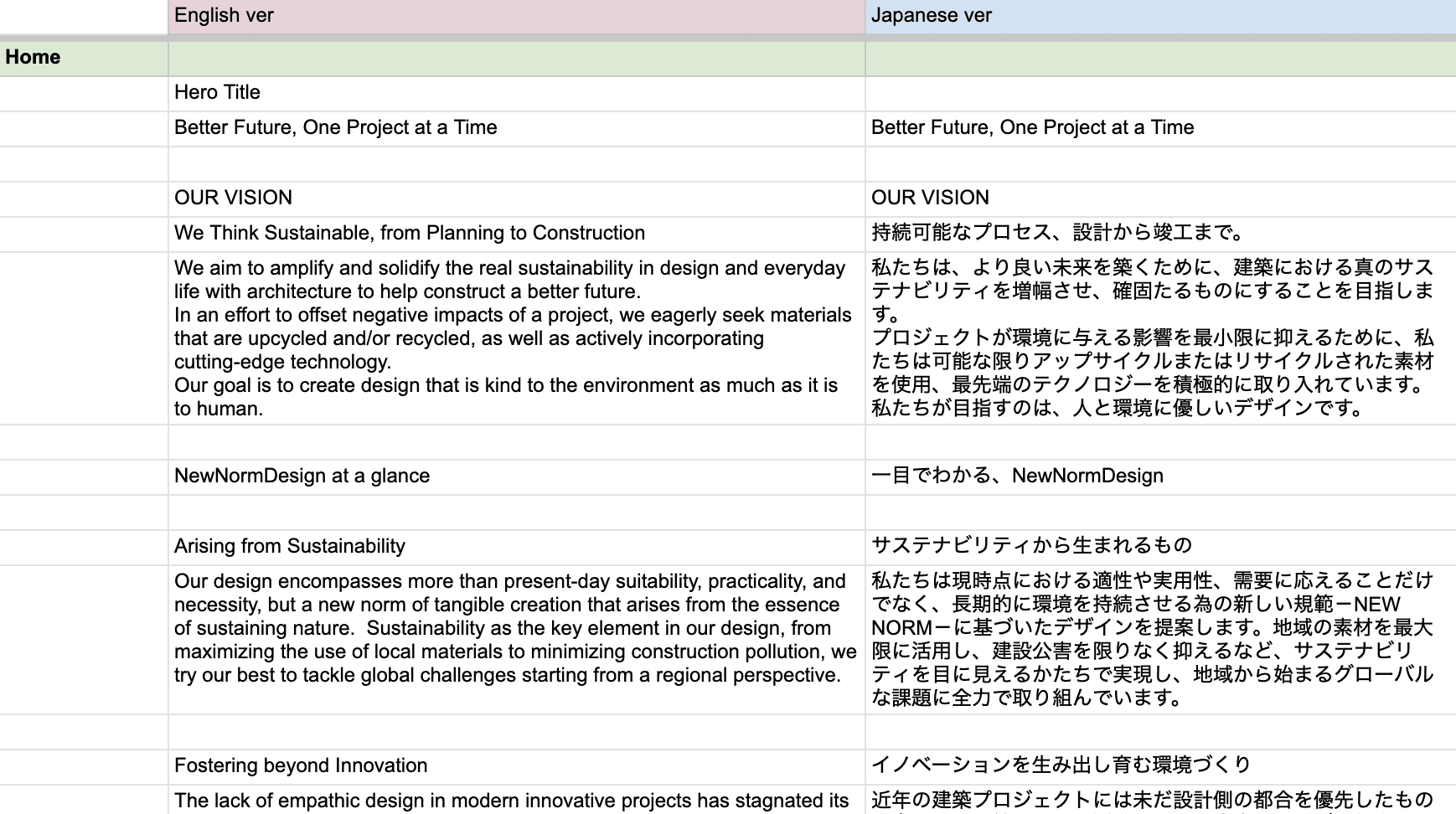
↑ Content manager for translated content and revisions tracking
Given the brand's dedication to sustainability, maintaining a consistent tone of voice and offering comprehensive information was especially important in effectively conveying their message.
I collected necessary information from the client and worked on UX writing which would ensure users had all the info they needed. My aim was to make the content clear and engaging, improving the website's user experience.
Final Design & Key Impact
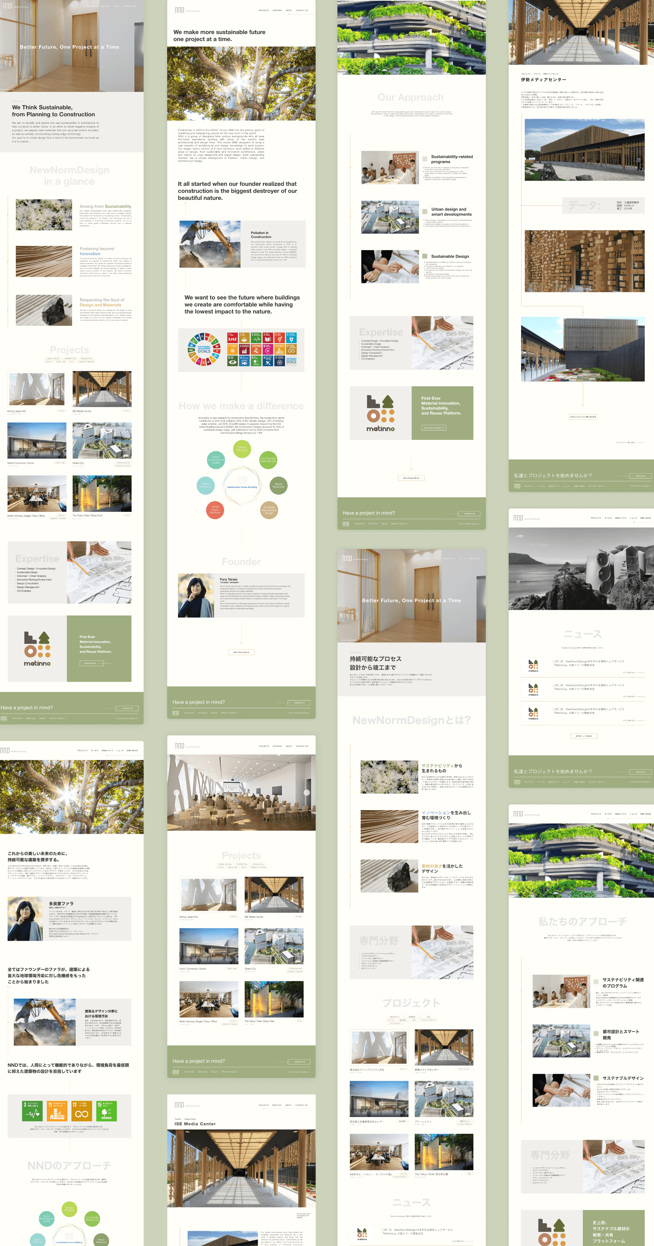
The final website embodied NewNormDesign's vision - fusing sustainable values with global accessibility. Core UX enhancements provide an engaging, bilingual experience that resonates widely while representing NND's core identity.
With this question in mind, I've dissected the design process into four key stages.
discovery
Uncovering the ethos
milestones
> Mapped client vision/goals for redesign through
interactive workshop
> Highlighted existing issues and confirmed
requirements for redesign
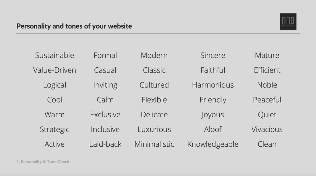
In this activity, the client picked out words that they felt matched NND's brand identity from a list of adjectives I put together.
This gave me a better sense of what qualities and values resonate with them when they think of NND.
Brand personality check
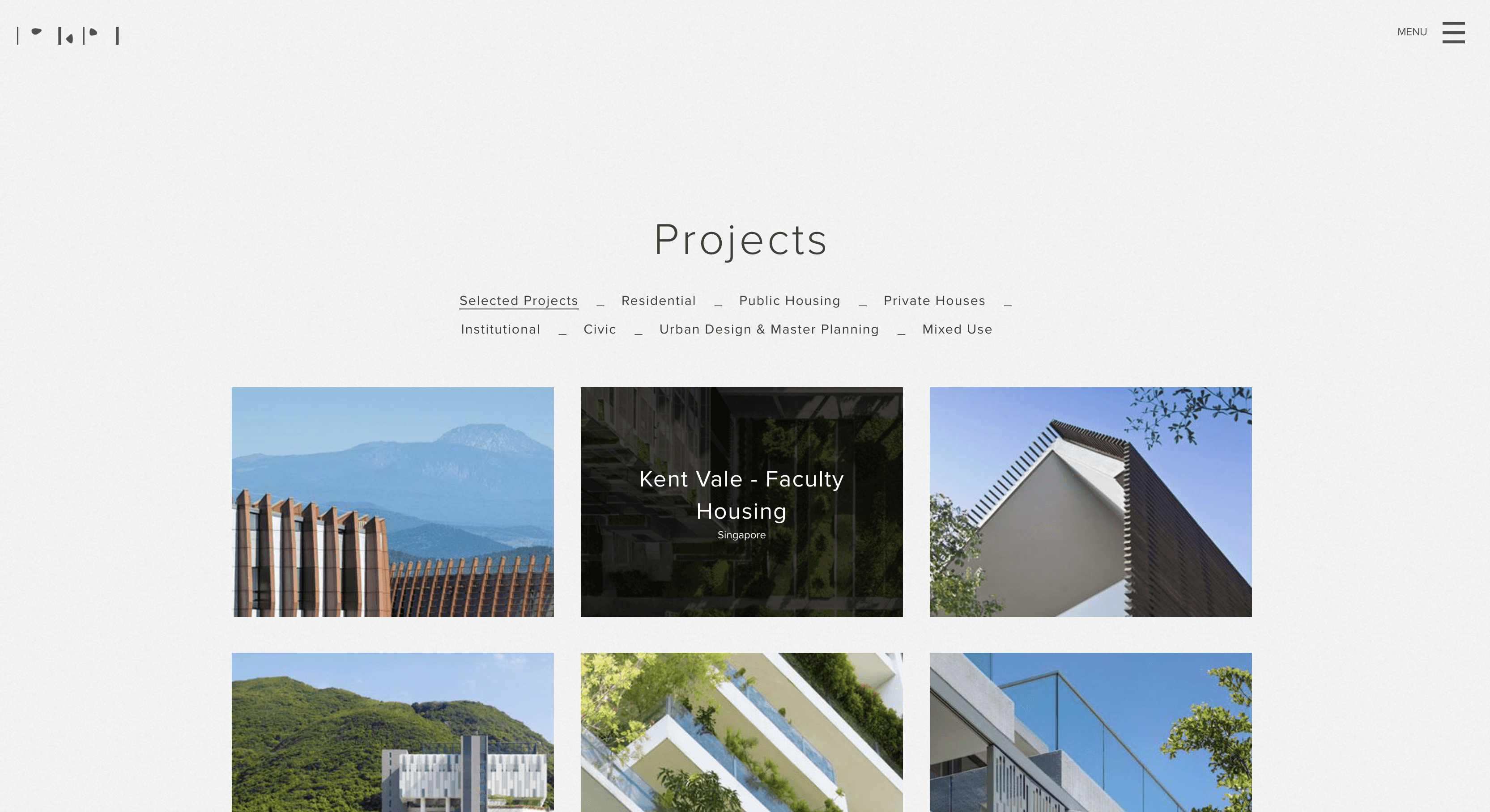
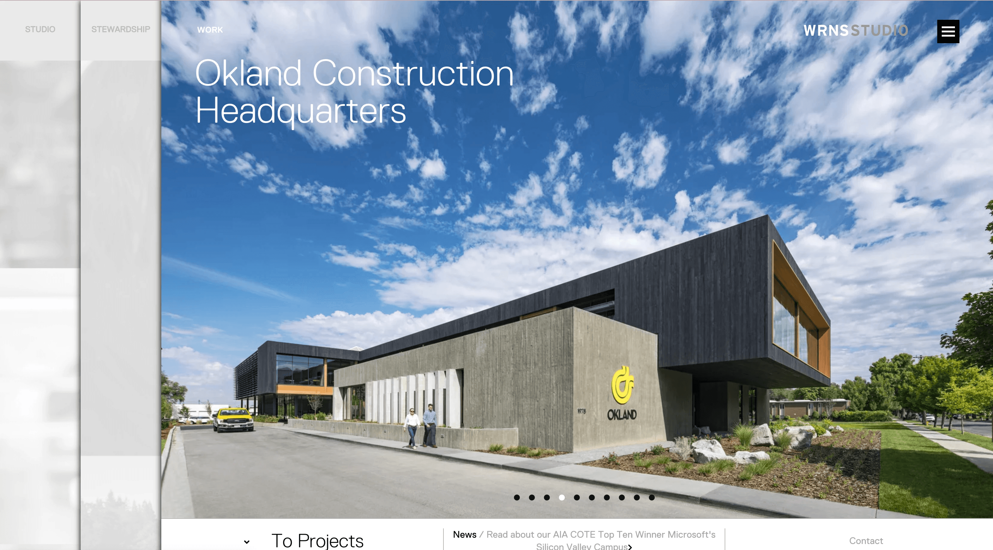
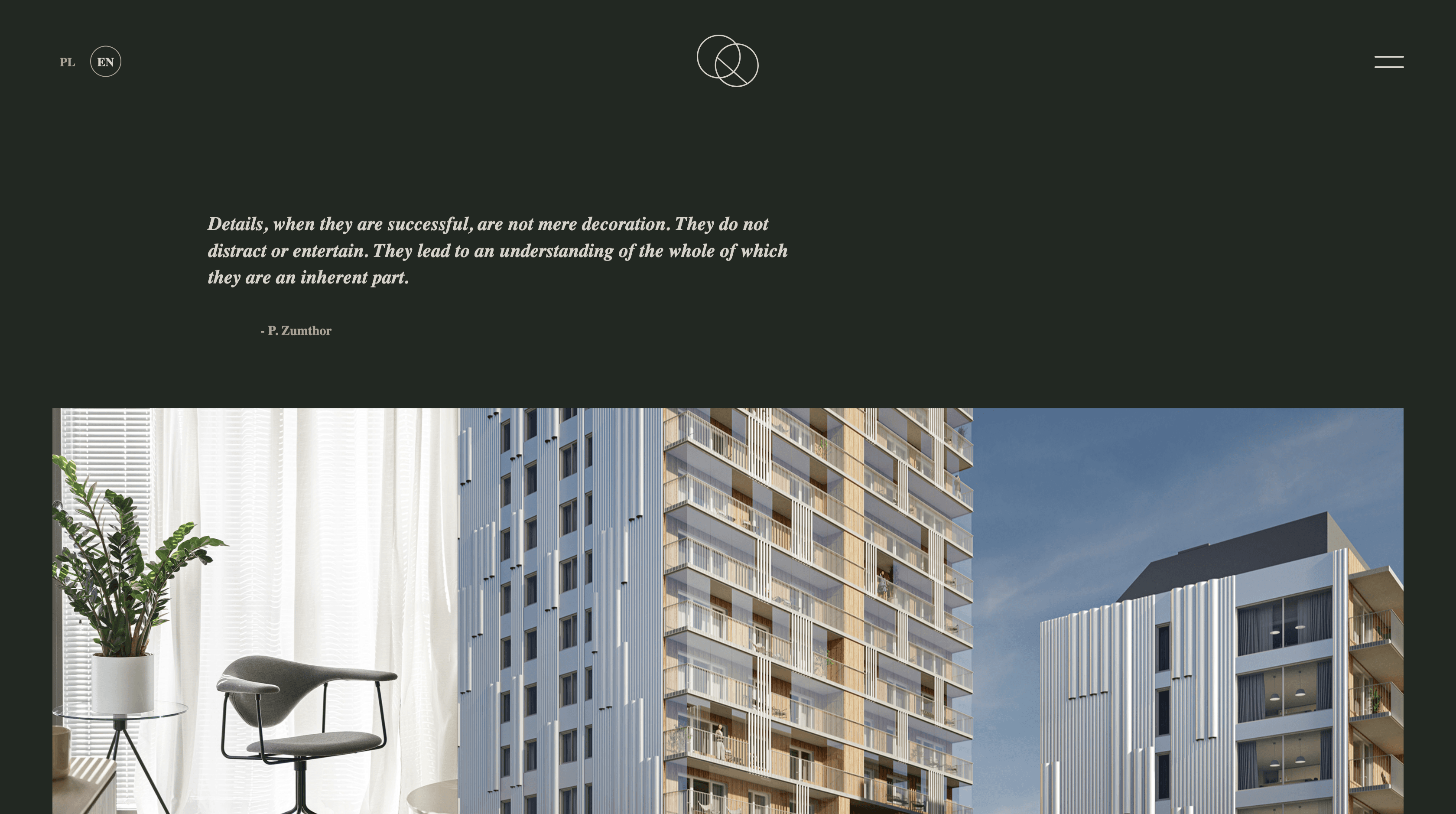
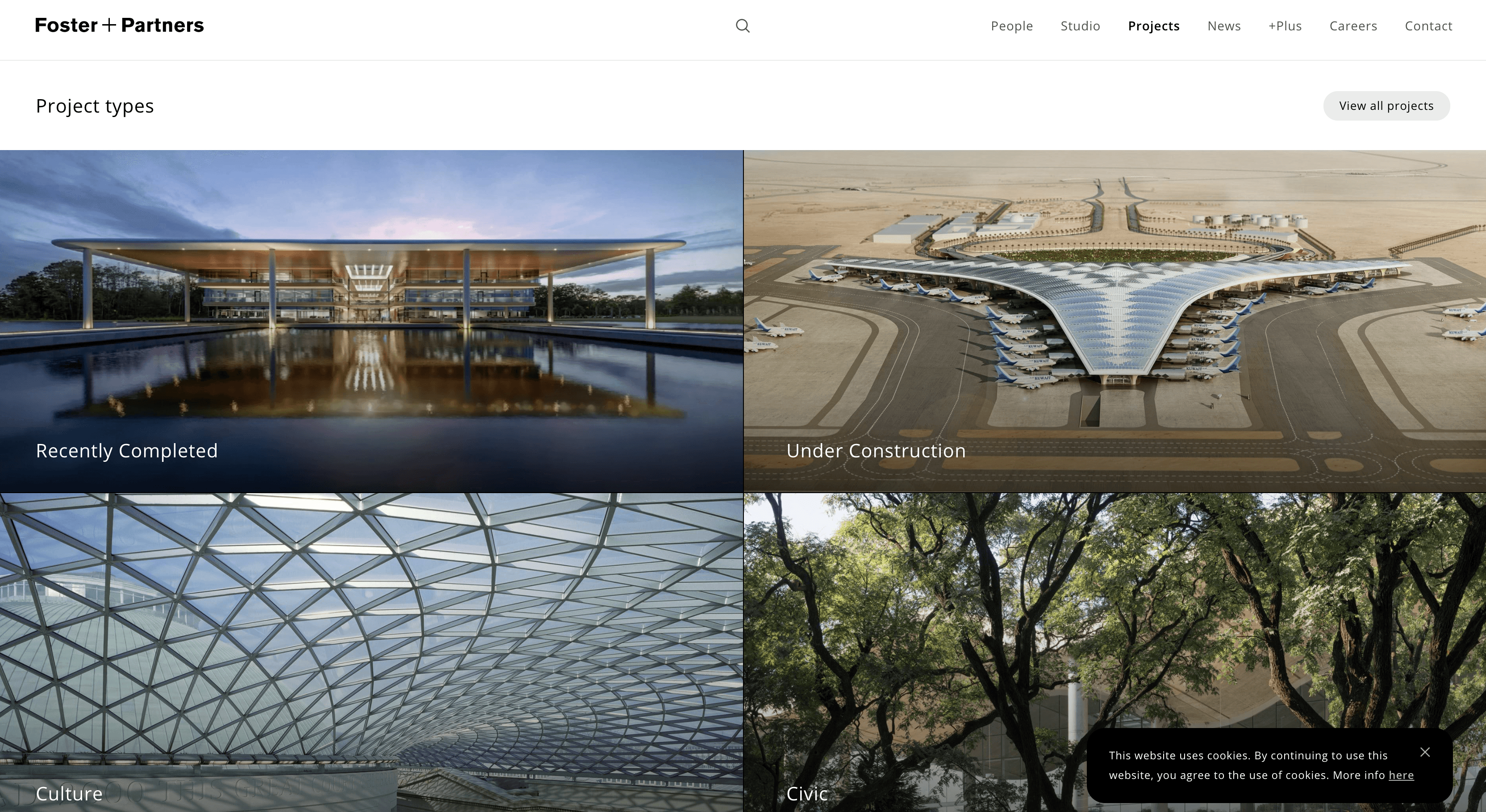
10-second gut test
Client rated various websites of architectural firms on a scale of 1 (least favorable) to 5 (most favorable) within 10 seconds of being presented.
The goal was to grasp the desired direction and draw inspiration from the client's preferences.
↓ Here's a sneak peek of the workshop
After initial website and industry research, I facilitated an online, interactive workshop to collaboratively map pains and align on a redesign direction.
Carrying out exercises sparked some ideas on how to showcase their ecological focus, differentiating the redesign. This established an eco-conscious North Star to guide the creative direction.
research
Grasping the landscape
milestones
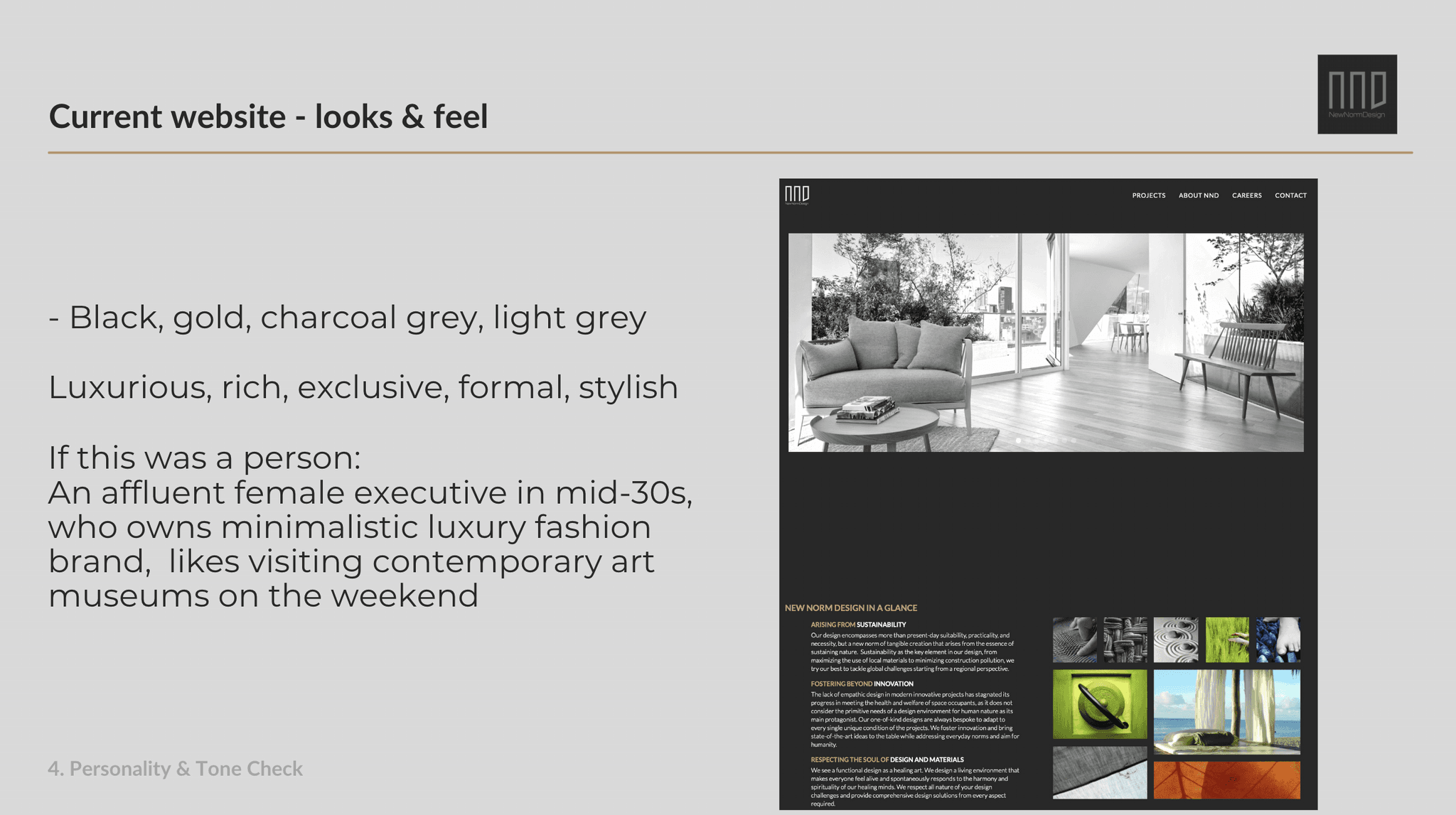
> Heuristic analysis on the current website
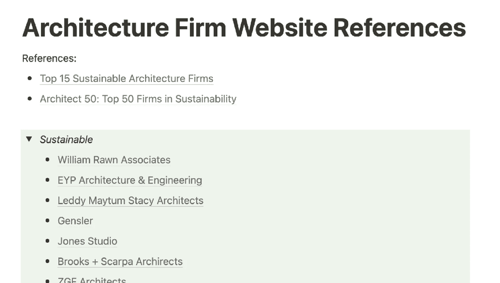
> Research and analysis on other players in the
industry
As a starting point, I performed a heuristic analysis on NND's current website, which gave me great insights into their current style and UI practices.
I also analyzed the websites of both domestic and international competitors in sustainable architecture to identify industry standards and best practices.
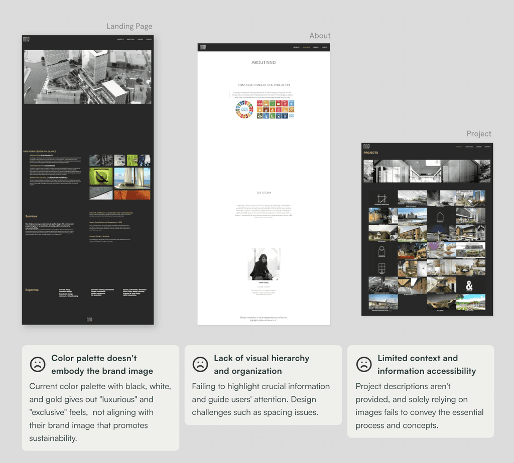
Here's how they enfolded
↓
Embracing the limitations
As this was my first design project, I encountered my fair share of bumps along the road. Some of the assets were missing, hosting platform change, site map changes, to list a few. While things weren't always as organized, this real-world was rewarding, and this taught me the value of flexibility and adaptability.
Communicate proactively
I was lucky to work closely with the stakeholder right from the start. Collaborative workshop and frequent communication helped us get on the same page, reducing conflicts in the design process. By getting a vague idea of what was coming, they were prepared, avoiding any surprises or wasted time.
✔️ Cohesive visual identity: Reflecting the brand essence
✔️ Tailored localization for Japanese audience
✔️ Elevated content strategy: Boosting credibility with context and narrative
When overwhelmed, organize
There were various tasks that needed to get done throughout this project, ranging from designing to writing, and it felt overwhelming at times. By using project management tools such as Notion, I was able to break down big tasks into smaller chunks.
UI is part of storytelling
While translating the brand identity was emphasized, I focused on creating a seamless user flow through website restructuring and content strategy. Design was an integral part of storytelling that contributed to an enhanced overall user experience.
