Project Overview ↓
Discover
・Heuristic analysis
・Stakeholder workshop
・User Interview
Ideate
・Brainstorming
・Stylescapes
Design
・Sketch
・Wireframe
・Prototype
Content
・UX Writing
Startup Work
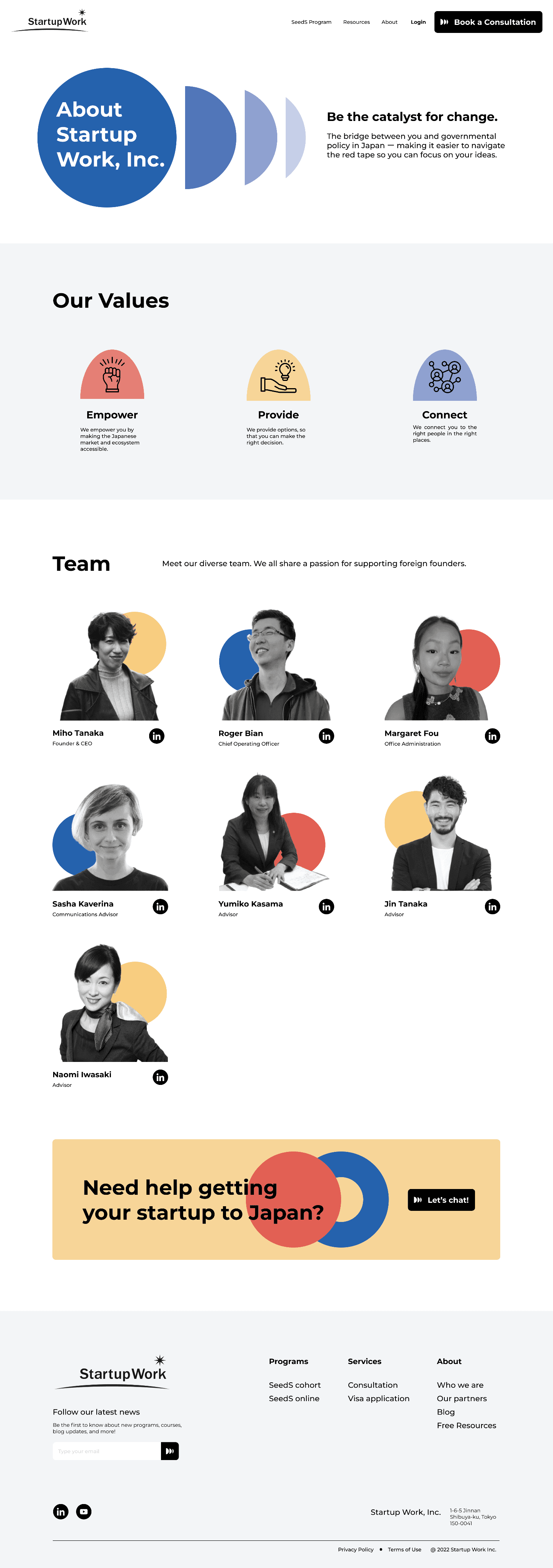
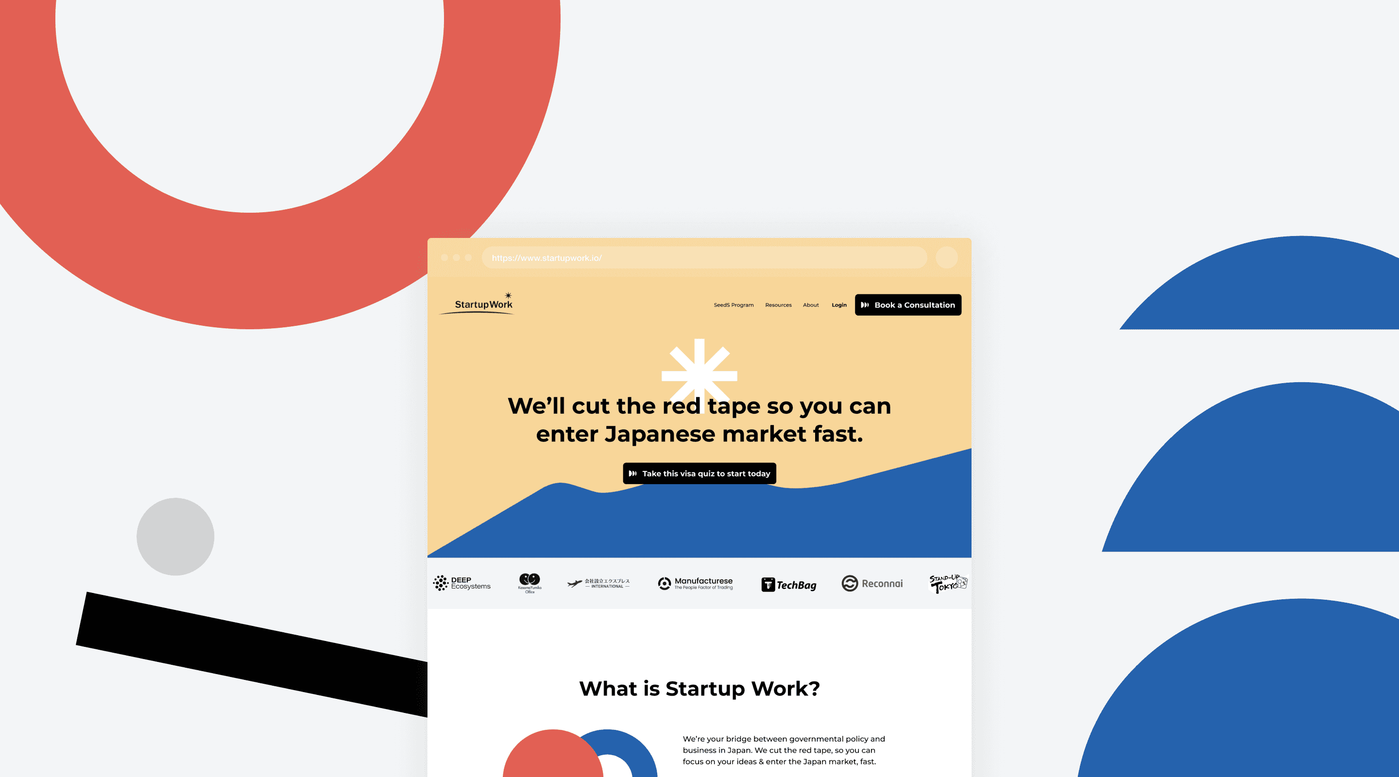
Startup Work is an agency that assists foreign founders in expanding their businesses into Japan. Seeking to attract more international founders interested in the Japanese market, Startup Work aimed to refresh its digital presence to showcase its services more effectively. I worked on rebranding their identity and creating an intuitive experience for visitors.
my Role
Web Design, Visual Design,
Content
settings
Me (Designer)
Project manager
tools used
Figma, Miro
duration
3 weeks
Reflections & Takeaways
Here's a walkthrough of my process ↓
Design and Research Work Together
Talking to users early on helped me understand what they needed and wanted. Hearing where they struggled guided me in fixing problems. I compared what users said to core business goals. This helped me make choices on the design direction.
Working as a team
Collaboration was integral to the success of this project. Teaming up with the project manager allowed me to observe firsthand the dynamics of effective client-designer communication. While the project manager oversaw the timeline, I took on the design responsibilities independently. The open environment fostered a culture of feedback and provided invaluable support.
Have a project in mind?
Drop me a line.
© Moeka Mieda 2024
mission
Design a visually striking, user-centric website with an intuitive information architecture tailored to foreign visitors, creating a memorable experience with clear calls-to-action.
problem space
The client noticed a lack of traction and engagement with their existing website, prompting the need to revamp both the visual design and structure of their online presence.
discovery & visual direction
Reimagining Startup Work
milestones
> Client workshop to review their current design
and understand their vision
> Stylescapes to establish design direction
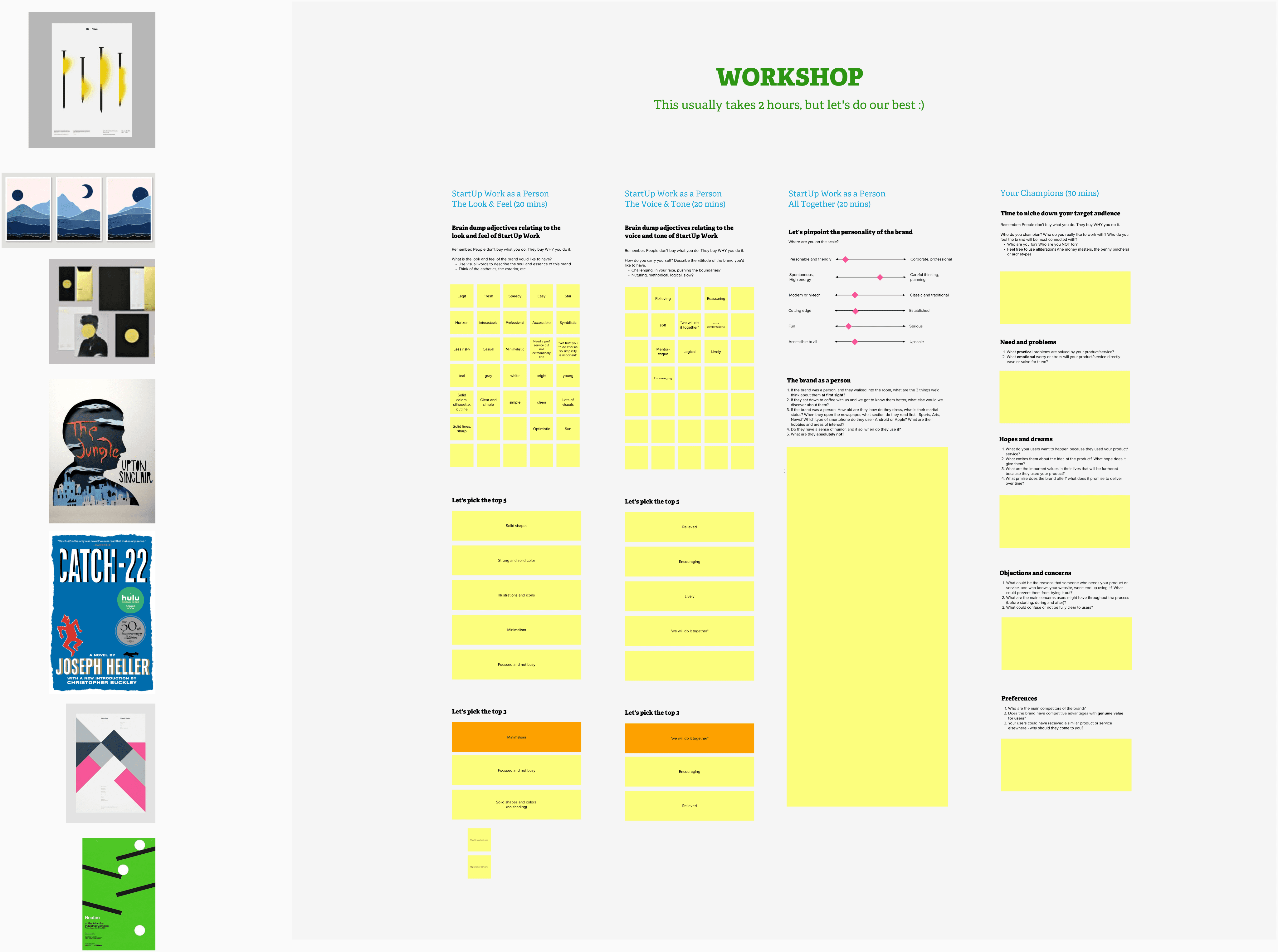
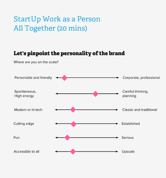

We began with a collaborative workshop with the founders, incorporating exercises to conceptualize a fresh visual identity that resonated with their core essence.
Additionally, through a joint review of their existing website, we were able to identify the underlying business challenges, establishing the key objectives for the redesign.

After the first call, I created three stylescapes —mild, medium,
and spicy— drawing insights from the workshop's findings.
This helped in establishing a cohesive visual direction.

MILD

MEDIUM

SPICY
↑ Client chose 'medium' as Startup Work's new visual identity
↑ Used Miro to guide the workshop
user interview
Identifying the pain points
milestones
> User interview to validate and supplement the
findings from the heuristic evaluation
To build on the heuristic evaluation, I conducted user interviews with 3 participants from the target user demographic: English-speaking professionals running/working for startups.
The result revealed that although the navigation was functional, users struggled to understand the core business offering and distinguish between individual services. This difficulty in distinguishing and comprehending key information could be attributed to excessive content density, inadequate visual hierarchy, and insufficient visual contrast between sections.

🌀
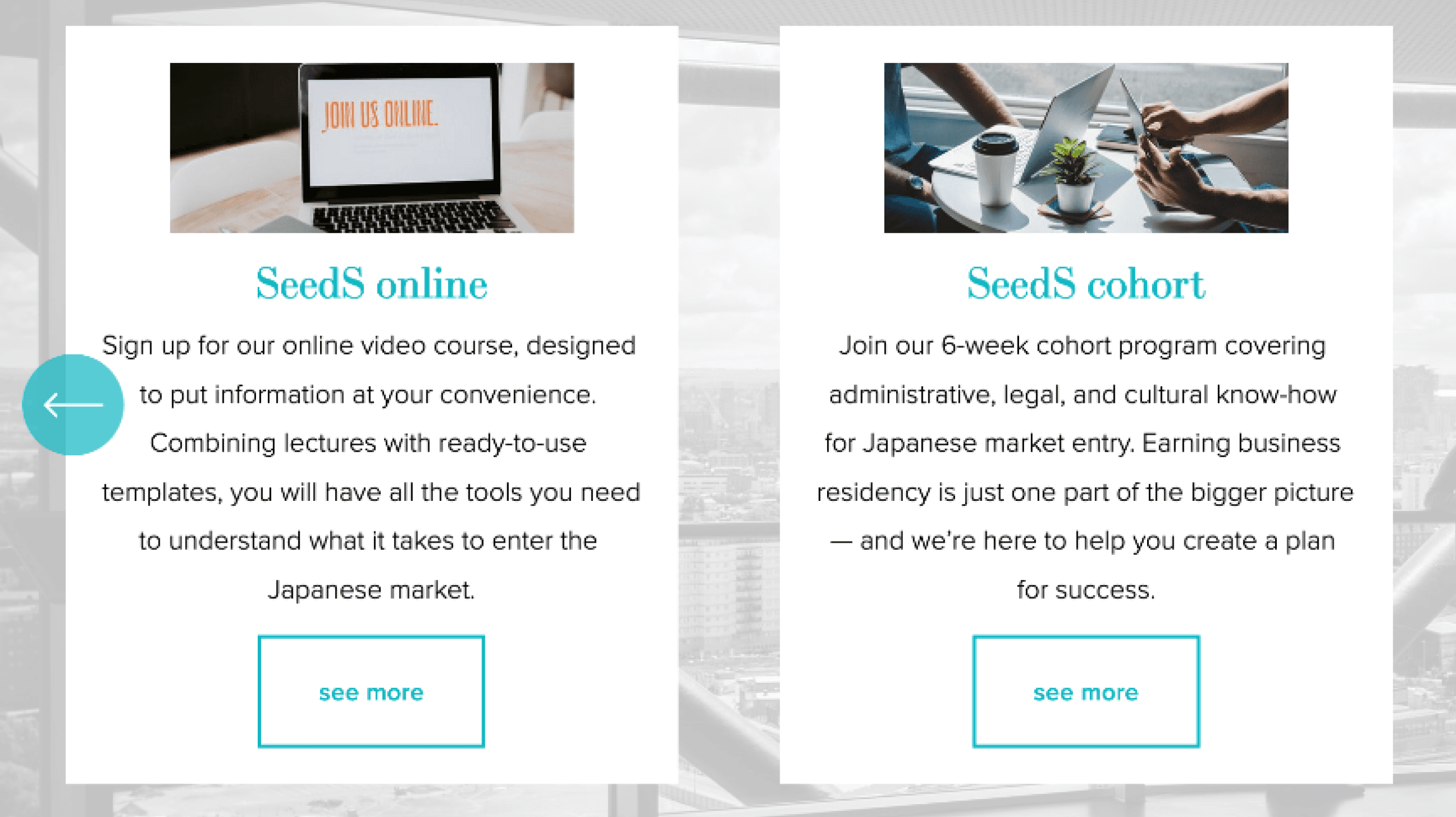
I don’t quite get the difference between “SeedS online” and “SeedS cohort”.
💚
Navigation is pretty straight forward, and it wasn’t hard to find certain information.
🌀
I’m not exactly sure what they do...are they an online course provider or a law firm that provide legal services?
💭
I wonder why the texts are all written in lower-case. It makes me doubt their credibility a little...
↓ Key insights from user interviews
Motivating Action Through
Context
Initial CTAs lacked contextual details on offerings, diminishing conversion rates.
New solution presents robust value proposition statements and social proof to compel desired user behaviors.

Enhancing Visual Hierarchy
Insufficient visual distinctions caused confusion between offerings, an issue raised consistently in testing. (ex. "What are differences between SeedS cohort and online?")
Employing contrasting designs amplified differentiation. Graphics also boosted memorability and connections to benefits.

Presenting Digestible Content
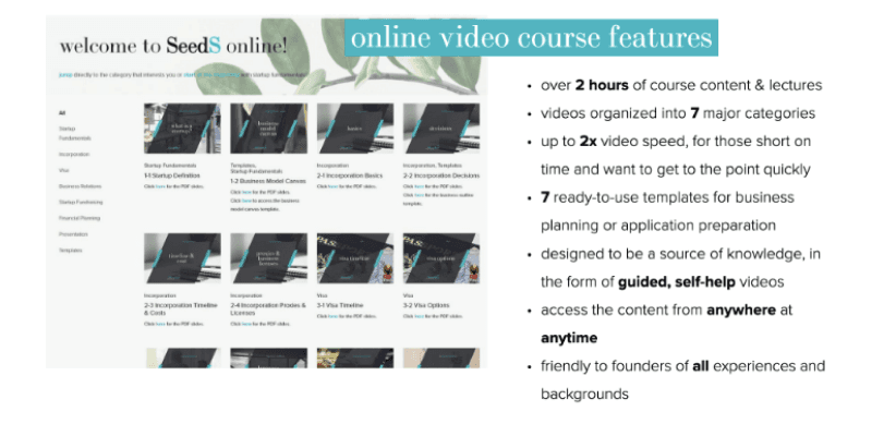
The initial content density overloaded users, obscuring core offerings.
By featuring the most crucial details upfront in scannable formats, comprehension rose demonstrably over previous versions. Additional specifics relocated to secondary pages for those interested.
Optimizing User Flow
As most visitors were founders, they needed clearly guided navigation to key data rather than excessive scrolling. (ex. scrolling through the carousel to find definition of each funding stage, which they're probably familiar with)
Through prominent CTAs and simplified layouts, users can self-direct efficiently.

ui design
Crafting design & content
milestones
> Designed site experience based on client's
vision and user insights.
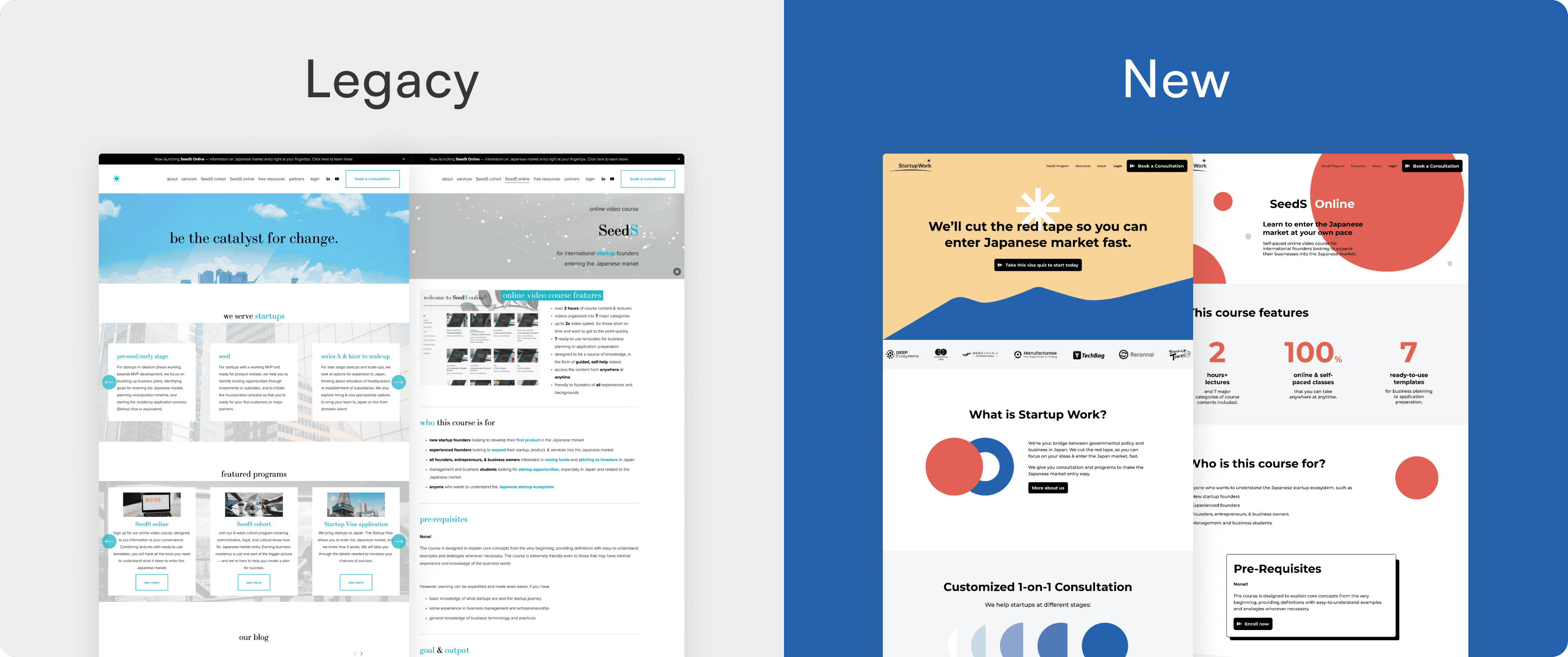
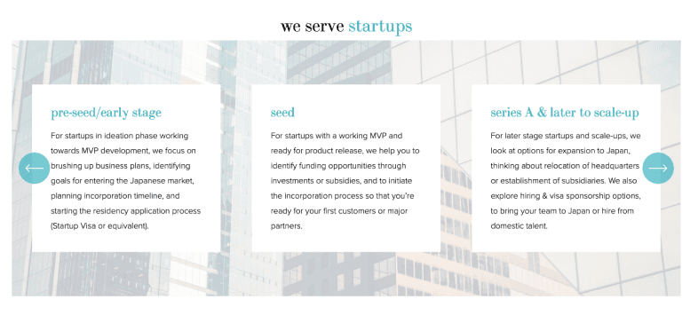
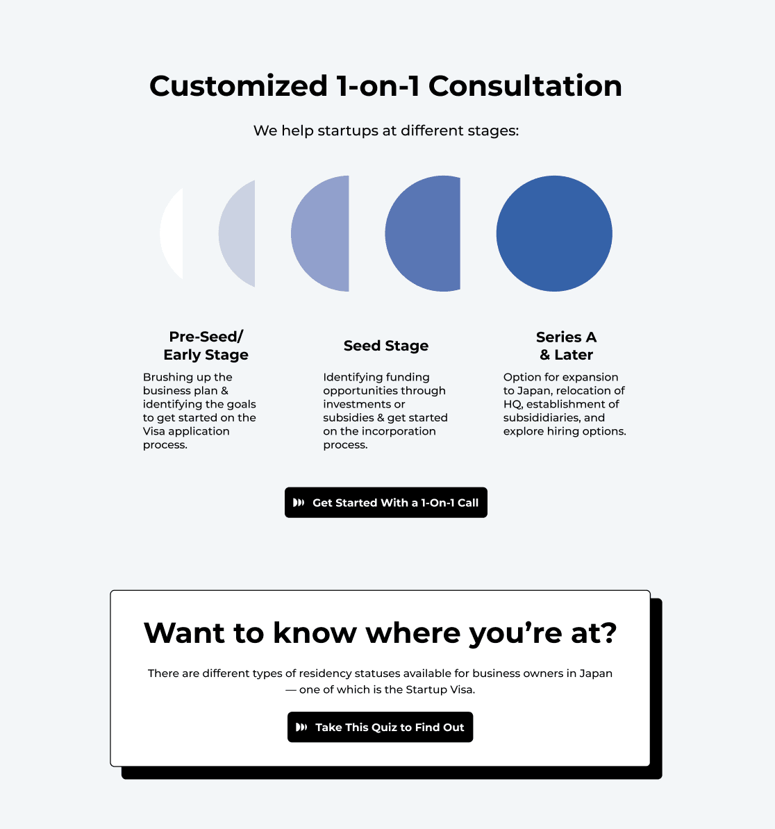
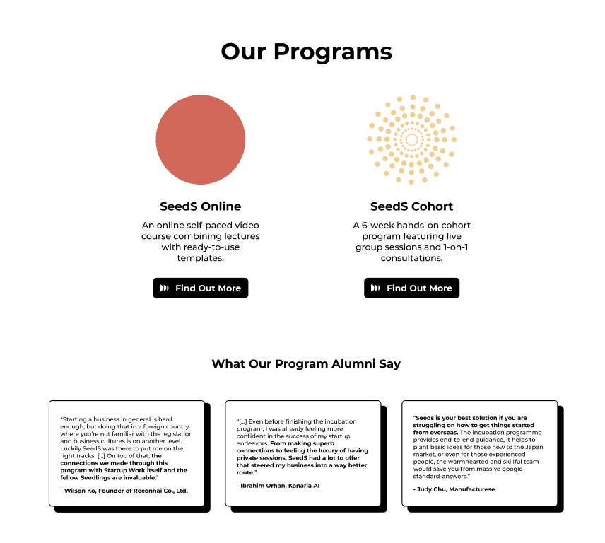
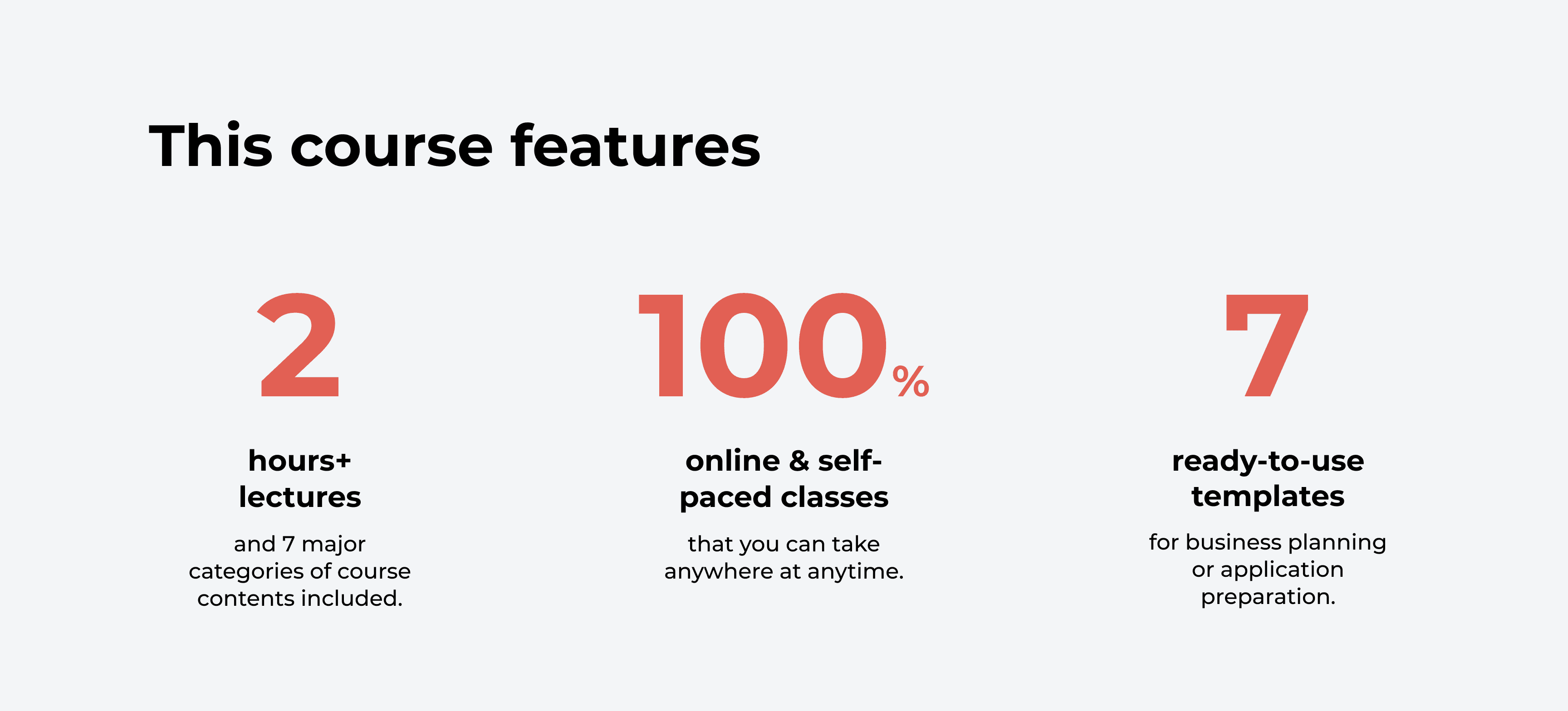
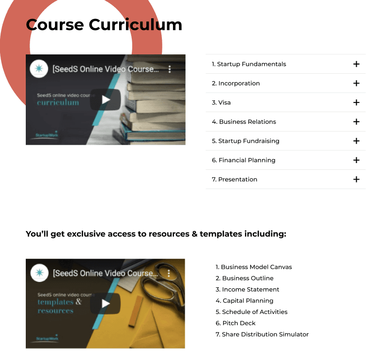


Through user interviews, it was palpable that an absence of hierarchy was leading to user confusion.
As I worked on the structure and design, I simultaneously focused on content development to ensure a cohesive and impactful user experience.
Here's critical rationale behind the final design ↓
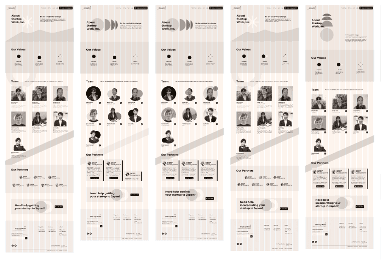
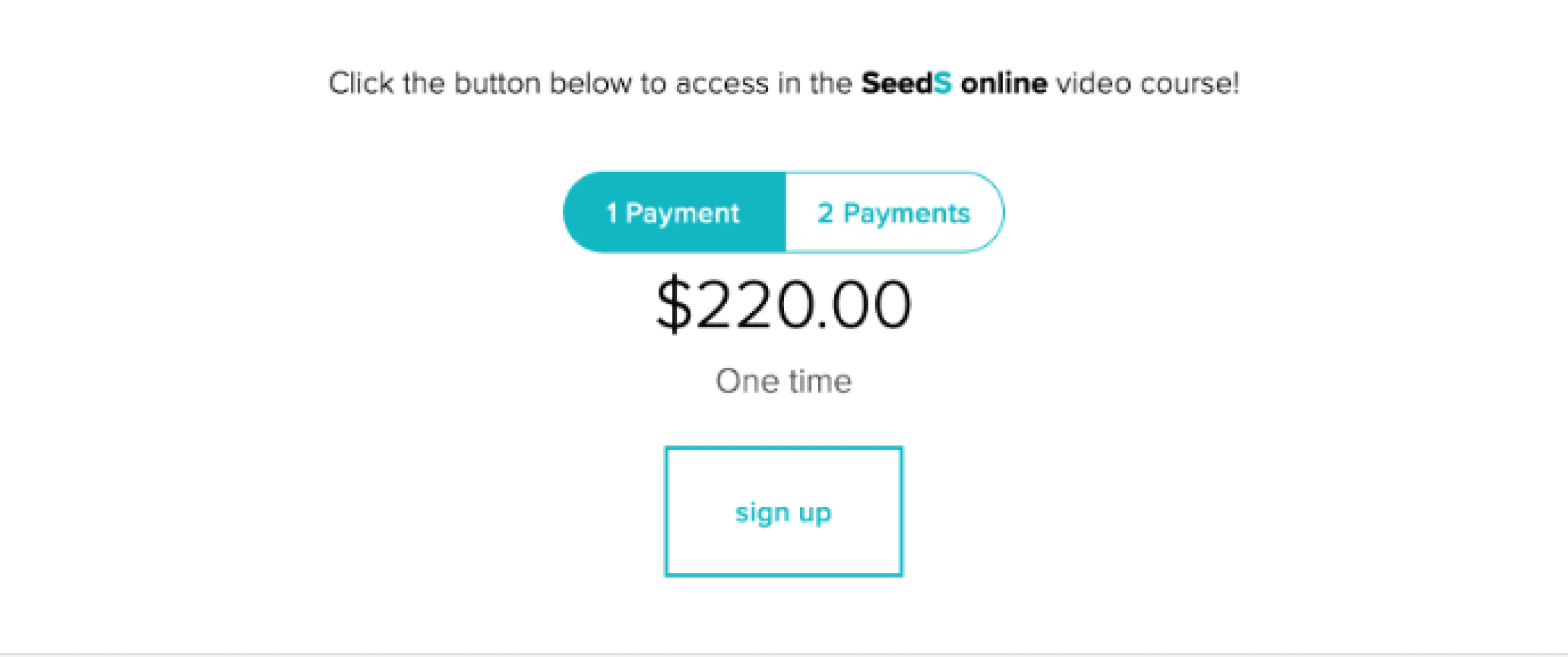
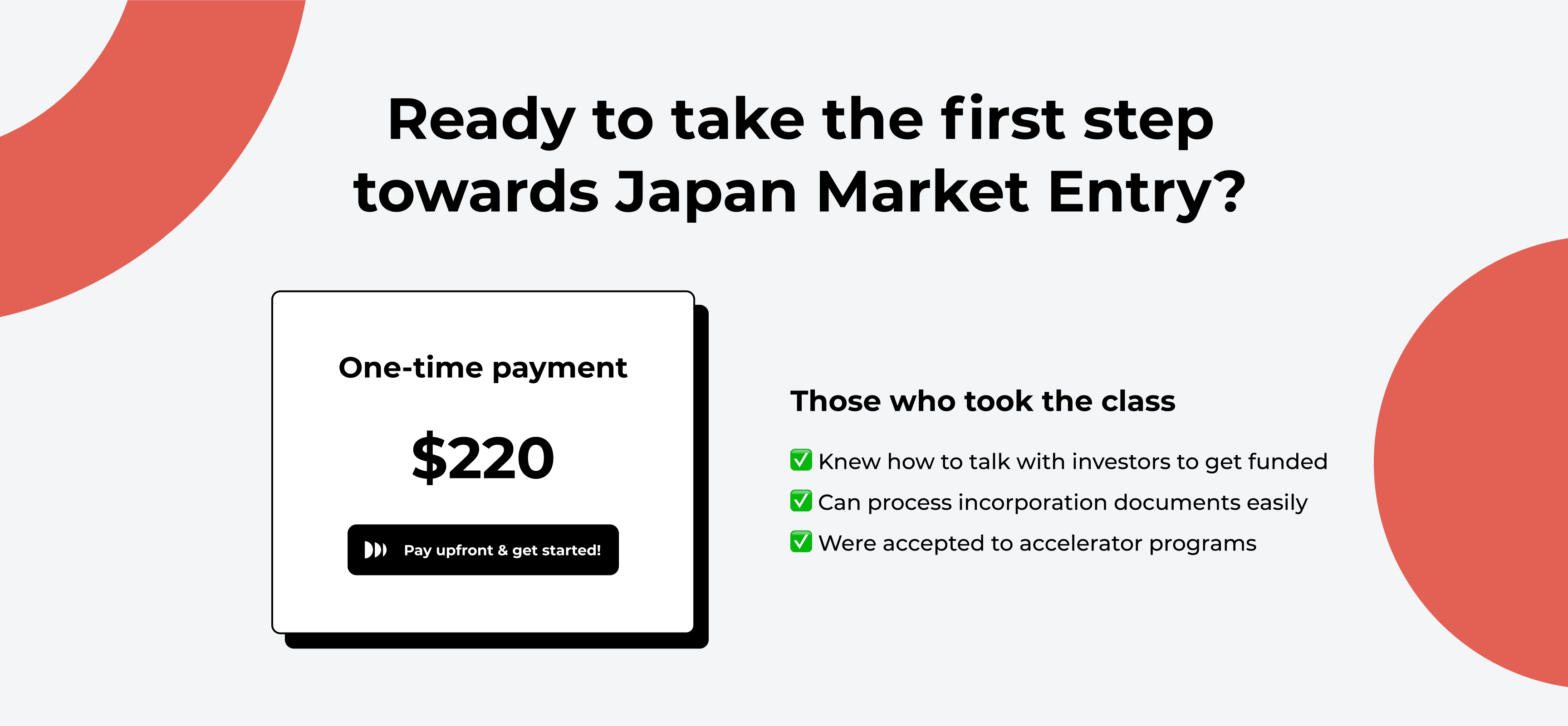
Final Design


